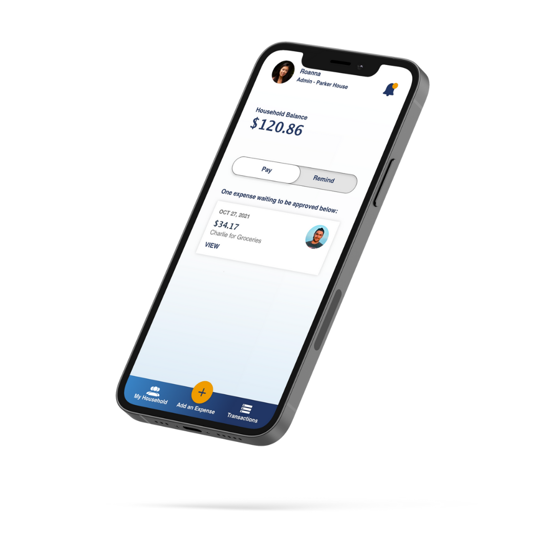
Billbuddy
One place to track and pay shared household expenses
INTRODUCTION
PROBLEM
79 million adults in the US live in a shared household, and this has only increased since the 90s. How can we leverage technology to simplify the way we manage household expenses, especially as more and more people live in shared households?
GOAL
Create a mobile app that makes it easy to view, track, and manage household expenses for everyone all in one place.
METHODS USED
Competitive Analysis, User Interviews, User Research Analysis, User Personas, Mental Models, User Journeys, Task Analysis, User Flows, Content Auditing, Card Sorting, Lo-Fi Prototyping, Rapid Prototyping, Mid-Fidelity Wireframes & Prototyping, High-Fidelity Wireframes & Interactive Prototyping, Usability Testing.
ROLE: User Researcher, UI/UX Designer
PROJECT SCALE: 3 Month Project
PRIMARY STAKEHOLDER: CareerFoundry UX Course
WHAT’S OUT THERE?
I started out my project by conducting a thorough competitive analysis of two existing competitors in the iOS App Store, Splitwise and Tricount, to better understand the problem space I’m working in.
WHAT DID I LEARN?
These apps all had their own way of managing group expenses but I was surprised that neither offered the option of setting recurring expenses which would be helpful for those living in a household.
Splitwise’s strength is without a doubt its integration with PayPal/Venmo but its interface had a lot going on and didn’t seem to follow a set style guide, resulting in a crowded interface. Would this be enough to deter users? There was only one way to find out what users are looking for in a household expense sharing app - user research!
GATHERING INSIGHTS
Through Google Forms, I conducted user surveys to understand general behaviors and sentiments around sharing household expenses. I then used these to help inform my user interview questions.
I then held user interviews. Here’s a sample of some of the questions I asked:
Who do you live with, and describe how general finances are managed in your household?
How do you feel about the process? What do you wish was simpler about the process?
What would you say helps you the most in making sure bills and people get paid on time?
Have you ever used a payment app or bill-splitting app before to manage your household's finances? Why did you choose the one you use?
I recorded all of the data points on sticky notes and sorted them into user needs and pain points.
I then used affinity mapping to better identify relationships and common themes from these data points. These are the 7 themes that emerged, and you can click to view the maps below:
Managing Household Expenses
Managing Rent
Payment Visibility
Payment Reminders
Budgeting
Fun
Ease/Efficiency
Here are some of what I found to be the most important interview insights, after affinity mapping. To view all of my insights, click on the button below.
Larger households use a monthly "house fund" which is a pool of collected money from which communal expenses can be charged. Smaller households or households constantly in flux may prefer direct charges between members.
Receipts are still a good source of truth but people want to move away from manual processes so digitalizing the input process would be helpful.
In all instances, one person was the liaison for collecting and forwarding rent to the landlord.
Most people prefer having visibility into where payments are going for the household. If there's a person managing finances, overall visibility is especially helpful for them and reduces unnecessary communication to the "middle person".
Most people remember to pay the bills and rent on time, but it helps to have reminders. Reminders usually lands on the person whose responsibility is to forward rent to the landlord. For them, an automatic reminder system would be helpful and save them time.
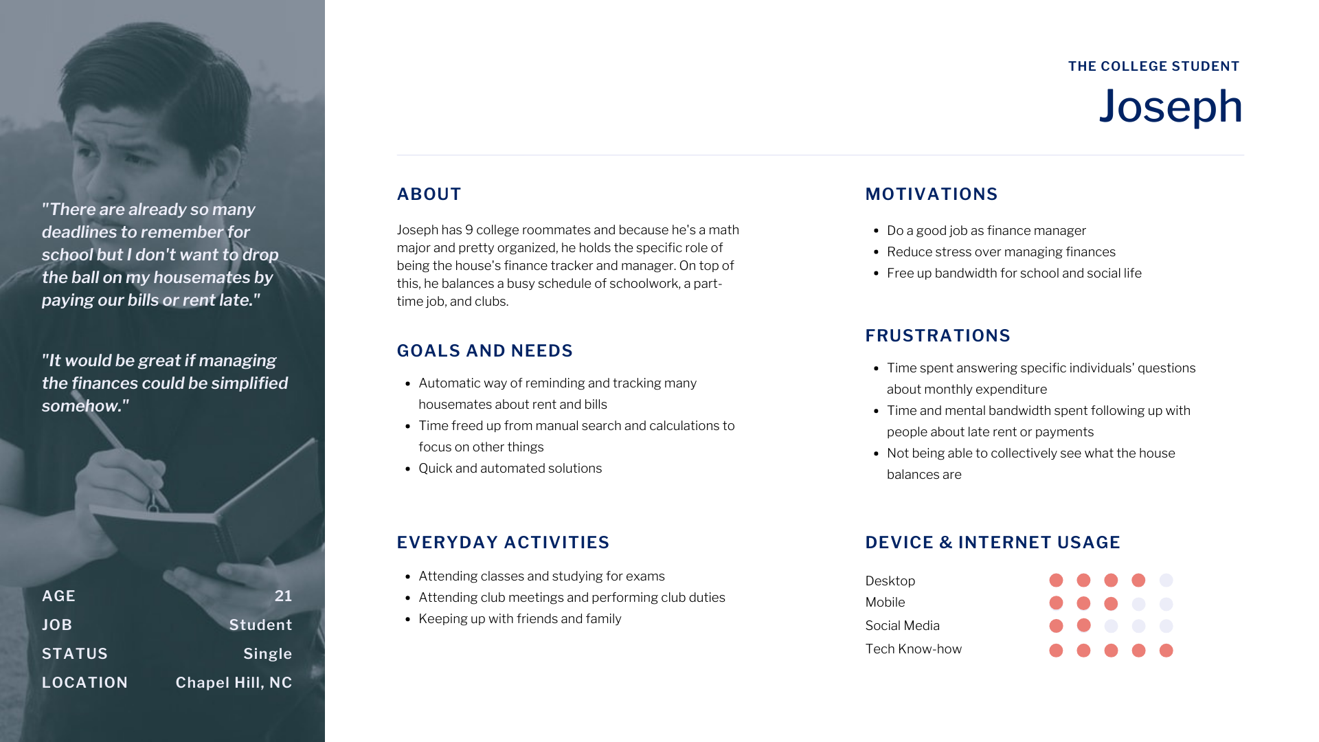
MEET JOSEPH AND MARIANNA
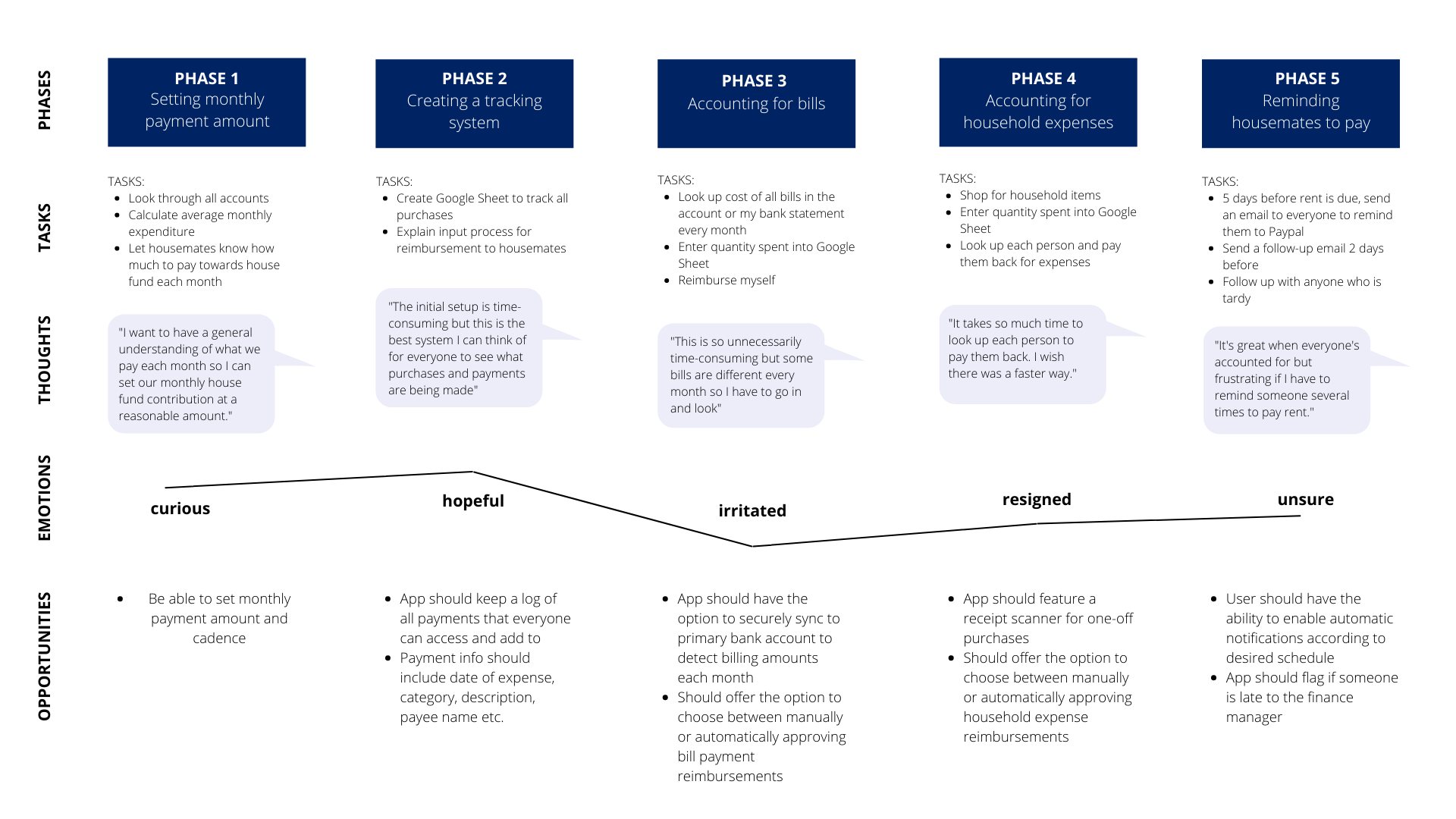
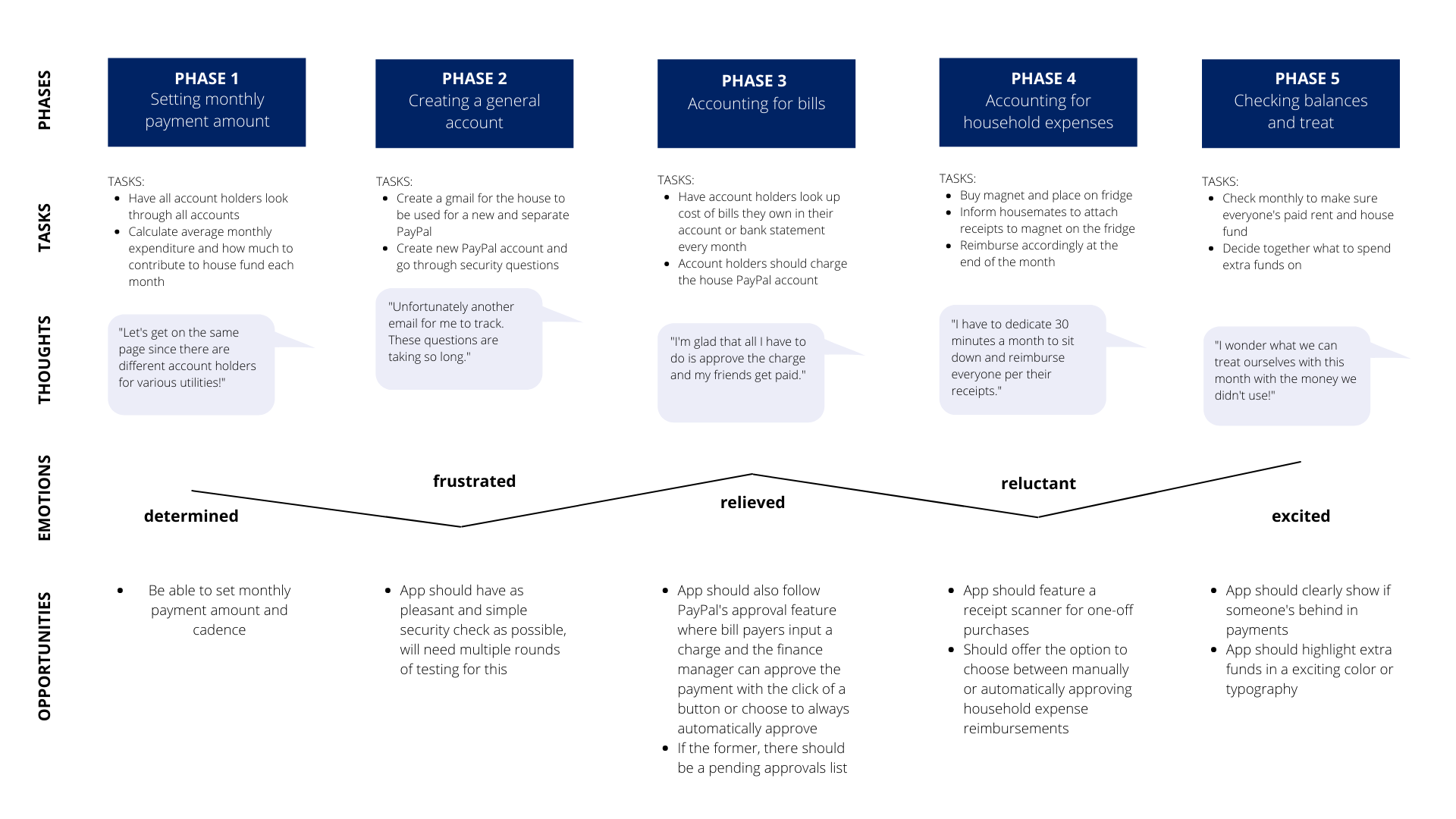
To help give all of my research a human face and narrative, I created two user personas. These will be a valuable tool to help us make empathy-driven design decisions down the road. From there, I created journey maps for each of them to help my team visualize the processes a user goes through in order to accomplish their household payment goals.

INFORMATION ARCHITECTURE
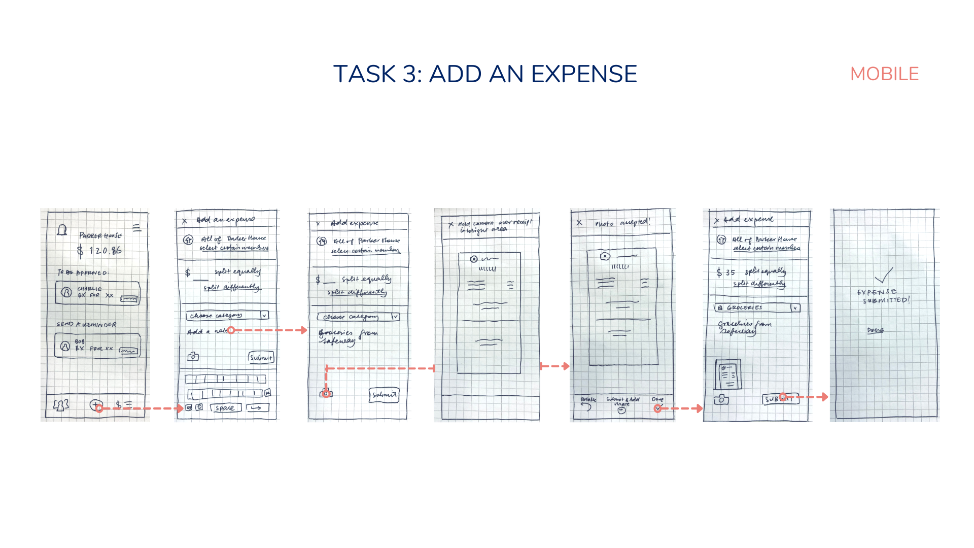
Based on my user journeys, I determined the various different essential tasks that would need to be performed on BillBuddy, and did task analysis as well as created user flows for each task. For example, for “Adding New Expenses”, here is my task analysis and user flow:
USER FLOW
TASK ANALYSIS
Open the app
Log into the app
Select transactions
Select "Add transaction"
Input "Store"
Input "Date of Purchase"
Input "Amount Spent"
Add details in "Description"
Select "Add Receipt"
Take picture of receipt
Select "Add picture"
Select "Submit transaction"
Check the transaction is added to transactions log
I then took a mobile first design approach and started listing content relevant to my personas, using a progressive enhancement methodology.
CREATING SITEMAPS
Based on what I knew about other apps, as well as my research so far, I created an initial sitemap. Click below to view it full-size.
Sitemap v.1 - Created based purely off of user journeys and personas
CARD SORTING
To get user input on my sitemap, I conducted a digital open card sort on OptimalSort with 5 participants acquired via Slack, with the cards on the left below. These results allowed me to create a similarity matrix that I could use to identify association patterns. Click to view in more detail.
These results allowed me to revise my sitemap. Click below to view it full-size.
Sitemap v.2 - Created based off of findings from my card-sorting exercise
WIREFRAMING
With my research-informed sitemap, I could start sketching wireframes. I sketched mobile and desktop wireframes to factor in differences in navigation and design patterns between the two breakpoints. I also sketched mobile and desktop wireframes for the top three most important tasks of the app:
Viewing your payment/expense status
Viewing past or scheduled transactions
Adding a new expense
LOW-FIDELITY WIREFRAMES - PEN AND PAPER
Click to view wireframes in more detail.
LOW-FIDELITY WIREFRAMES - BALSAMIQ
Click to view wireframes in more detail.
LOW-FIDELITY PROTOTYPES FOR ONBOARDING - ADOBE XD
For onboarding, I decided to use coach marks on the homepage to point out only the top 4 features a new user would need to know. In terms of my prototype, I kept to a very minimalistic design which includes conventional iconography. Many features only appear after tapping, such as the popout menu for the settings panel, or dropdown menus for expense categorization. The transaction history has a filter by date feature so the user is not inundated with information on the screen.
Click to view wireframes in more detail.
MID-FIDELITY PROTOTYPES - ADOBE XD
I then started building out mid-fidelity prototypes in Adobe XD. My goal for these is that they would be functionally accurate enough for user testing. Click to view wireframes in more detail.
USABILITY TESTING
TEST PLAN
Goal
The goal of this study is to assess the learnability for new users interacting with the expense-sharing application for the first time on mobile. We would like to observe and measure if users understand the app, its value, and how to complete basic initial functions such as logging in, viewing and approving requested expenses, and adding new expenses. We want to improve major errors in the design process as we observe users engaging with the app.
Test Objectives
Determine if participants understand what the app is about quickly and easily (i.e., an application for sharing expenses with your household) and the value it provides.
Observe how users navigate and find information about expenses from the homepage—can they successfully find expenses in their queue and add a new expense?
Methodology
The study will be conducted as moderated, in-person tests with those who live within 10 miles from me, and as moderated remote tests with those who live further. The test will include a short briefing, task performance with BillBuddy conducted on a mobile app, and a debriefing.
Script
I asked some basic demographic questions including questions about their living situation, three background questions, and asked them to conduct two tasks with corresponding scenarios.
Participants
The study tested 6 participants who were recruited through my personal network to participate in the study. They were screened for basic demographic information to ensure they fit with the user persona of BillBuddy.
ANALYZING THE RESULTS
Affinity Mapping took place to group participants’ feedback into themes inside of main categories:
Observation
Positive quotes
Negative quotes
Errors
Rainbow Spreadsheet - used to consolidate these groupings and was used to visually display how many participants had similar experiences.
Neilson’s Error Rating Scale - Above you will see the top five test errors identified by severity with Neilson’s Error Rating Scale and the frequency users had similar experiences.
ISSUES ADDRESSED
Original (left); Revised (right)
Issue 1: When approving expenses, some users were not able to skip making a comment.
Suggested Change: Allow commenting only when people choose to request an update or decline the expense.
Evidence: 3 of the 6 participants wanted to skip the comment section but couldn’t. 4 participants wanted to know if they could comment if they were to decline.
Issue 2: Users were hesitant to outright decline if they just wanted a small update.
Suggested Change: Add a “Request update” button for those who don’t want to outright decline.
Evidence: P2 and P6 gave the feedback that they would want the option to just request an update rather than outright decline.
Original (left); Revised (right)
Issue 3: It is unclear whether this interface is what every household member sees or just the finance admin if there is one.
Suggested Change: Add the words “Admin” to the screen. Explain in the interview script that they are participating as someone with an admin view, but that someone without admin view wouldn’t necessarily have to approve all expenses.
Evidence: 3 of the 6 participants asked what others’ interface would look like, if it would be the same or different to what they interacted with.
Issue 4: “Expense approvals” and “Reminders to pay” look too similar/merged on the homescreen.
Suggested Change: Either make the two sections slightly different colors, and maybe add a line in between. OR toggle to view each section.
Evidence: 2 of the 6 participants commented how they would appreciate if these two sections were more distinguished from each other. It really affected P3’s experience as she is very visual.
Issue 5: Unusual experience as users expected menu options to be top left.
Suggested Change: Swap placement of alerts and menu options.
Evidence: P2 and P5 expected menu options to be top left, referencing other app experiences.
PREFERENCE TESTING
I needed to conduct a preference test between two background images for the first screen, the login/signup screen. I tested this because it will be the first interaction the user will have with the app and I want to make sure that their first impression was inviting.
Methodology The study was conducted remotely using UsabilityHub. Participants were presented with two versions of the same screen - the login screen. They could do this on any device, and had the option of leaving a comment explaining why they preferred one version of the other.
Participants & Schedule A total of 11 participants were tested remotely between December 26 and December 30. They took an average of 1 minute and 26 seconds to complete the test.
Results 11 participants participated in the test in total, and the results were 45% for Version A and 55% for Version B, with Version B winning by one vote. However, one of the votes for Version B had a comment that said both images would work.
The results are so close that I can reasonably say neither design is significantly more inviting than the other. Based on the comments, both images were inviting depending on what inviting looked like for the tester. For Version B, people mentioned they thought the cool tones and professionalism of the image were inviting, whereas for Version A, people mentioned that the lighting and warm tones was inviting.
The Updates If there is a way in the future to segment the images based on the user profile, I would consider it since both images were well-liked.
But for the purposes of choosing one image, I will update the app with Version B since one person mentioned "gender diversity" was a pro, and this is something that Version A lacked. One of the improvements that people wanted for Version B can easily be made - such as increasing the darkness of the black layer behind the logo to better the visibility of the logo.
VISUAL DESIGN
At this stage of the design process, I was ready to start working on hi-fidelity prototypes by applying visual design principles, Material Design guidelines, grid and spacing fundamentals, accessibility guidelines, and design elements that would create a delightful experience for the user. I created a Style Guide and UI Design Language System to retain visual integrity for developers. View them through the buttons below.
Click each slide to view my visual design decisions in more detail.
DESIGN ITERATIONS
The app’s design and usability have been refined over rounds of user testing and prototyping. View my reflection on the design changes for three of the screens below.
THE CURRENT PROTOTYPE
Although there are still more screens to build, design, and test, I’m happy with where the current screens have progressed through user testing and iterative design. I believe testing should be an ongoing part of the product design cycle, and plan to continue testing and iterating.
For now, I invite you to test out the current prototype on Adobe XD and leave your feedback.
