Wordsmith
Empowering people to learn new vocabulary
INTRODUCTION
PROBLEM
70% of adults claim they want to learn a new language but they can't fit in the time to build a vocabulary. How do you build up a new vocabulary when your schedule is busy and there doesn’t seem to be a spare minute to even start?
GOAL
Create a mobile app that provides language/vocab learners with a rewarding experience that motivates them to learn.
ROLE: User Researcher Designer
PROJECT SCALE: 3 Month Project
PRIMARY STAKEHOLDER: CareerFoundry UX Course
METHODS USED
Competitive Analysis, User Interviews, User Stories, Task Analysis, User Flows, Wireframing, Usability Testing, Lo-Fi Prototyping.
WHAT’S OUT THERE?
I started out my project by conducting a thorough competitive analysis of existing competitors in the iOS App Store to better understand the problem space I’m working in. Click on the thumbnails to view my thoughts on these three apps below.
USER INTERVIEWS
These apps all had their own way of displaying vocabulary words but I was surprised that few offered the option to upload your own words, which would be helpful for those learning off of a set curriculum. Between the three, there were many different details and features but I questioned if some of these were necessary or whether the crowded interface was deterring people from using the app on a regular basis. There was only one way to find out what users want in a vocab-learning app - user interviews!
PEOPLE I INTERVIEWED
GATHERING INSIGHTS
I conducted user interviews with a few people I knew who had attempted to learn a language in the past 5 years. A sampling of the questions I asked:
What is a challenge when learning new language/vocabulary?
What would you say helps you the most when learning a new language/vocabulary?
Have you ever used a mobile app in learning a new language/vocabulary? Why did you choose to? Why did you choose the one you chose?
Was the app useful? Why or why not?
…and here’s what they said:
"I think practicing and reinforcement over multiple days helps me the most to learn new vocab."
— Stephen
“"I felt good when I was on a streak of using Duolingo which enticed me to keep going."
— Jayla
“I made vocab words on my computer but studied the flashcards on my phone because it was easier."
— Amy
"Learning with someone else helped me stay accountable for my learning."
— Amy
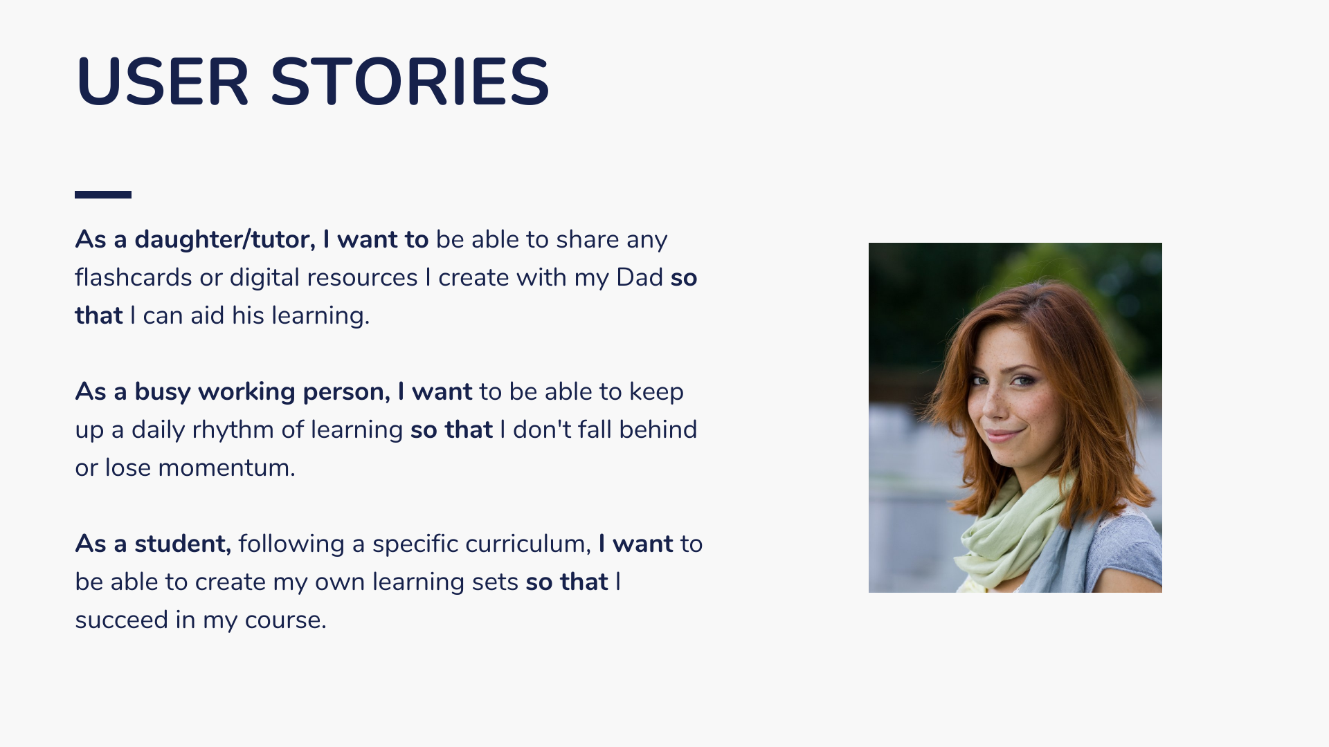
These were great insights, but I needed to consolidate it all into one user persona named Amy. This helped me refine the user needs into a working hypothesis. Learn about Amy below - her user stories, and the problem statement and hypothesis that followed.


EARLY THOUGHTS
With Amy’s goals and problem statements in mind, I was ready to start thinking about information architecture - how to structure the app to help her reach her goals. Since I’m creating this product from scratch, I decided to define two important tasks for Amy and run a task analysis for each one. I then drafted potential user flows for each of these tasks, and tested out two diagramming tools - Google Drawings and LucidChart.
TASK ANALYSIS
Task 2. A way to upload new vocabulary words and definitions that allows users to input their own definitions
Entry Point: Open App
Success Criteria: Create a learning set
Tasks:
Open the application
Go to learning sets
Click "Add new"
Manually input words and definitions, or import csv file, or paste words and definitions
Give the learning set a name
Click "create set" when complete
Task 1. Onboarding or Login
Entry Point: Open App
Success Criteria: Arrive at homepage/dashboard
Tasks:
Open the application
Select Create Account or Sign In
Complete onboarding process or input necessary credentials
If new user, select learning preferences and settings
Arrive at homepage/dashboard and start learning
USER FLOWS
WIREFRAMING
I busted out pen and paper and started sketching some initial designs for the two tasks I had created user flows for. I wanted to capture all of the components that go into the user’s experience of these tasks, including transition pages, onboarding tips, and confirmation messages. Since these still needed to be tested and would likely go through more iterations, I kept these designs low-fidelity and focused more on function than visual design.
VALIDATING THE DESIGNS
And then it was off to usability testing! To assess the usability of the navigation and features I designed in my wireframes, I made an interactive prototype through Marvel and ran three 10-minute usability tests. I gave my participants 5 scenario tasks and measured how effectively they could complete each task according to Jakob Nielsen’s Five Components of Usability:
0 = I don’t agree that this is a usability problem at all
1 = Cosmetic problem only: need not be fixed unless extra time is available on project
2 = Minor usability problem: fixing this should be given low priority
3 = Major usability problem: important to fix and should be given high priority
4 = Usability catastrophe: imperative to fix before product can be released
WHAT DID I LEARN?
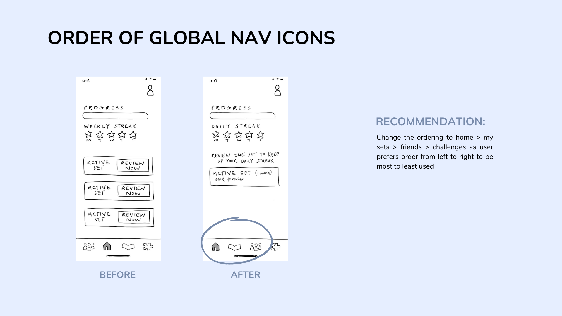
The issues that scored a 3 had to do with the onboarding tour. I learned that I needed to show how to move through the tour, as well as how to exit the tour, more clearly.
I also learned that it was helpful to add the “Share Set” action to multiple pages, since users might want to take this action from the “Sets” page or the “Friends” page. This requires only adding an icon so it’s an easy add that doesn’t affect the overall page too much.
I also needed to simplify some of the pages.
With these insights, I revised my wireframes and prototype.
MOVING FORWARD
There’s still a lot more to explore with the Wordsmith app. Should there be built-in word-packs users can learn from, as well as the ability to upload your own words? How might we implement research-backed study techniques into the app? We added the “daily streak” feature but what are other positive pressures we can apply to encourage regular learning? These are some of the questions I’d like to expand on, but for now check out the current state of the prototype by clicking below!


